

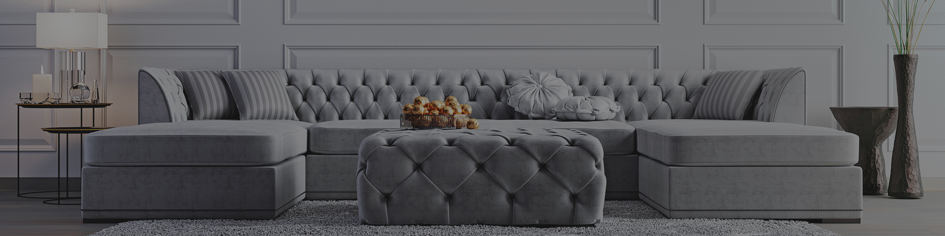
Best Colours for a Living Room in 2026
Brian Davies - 20th October 2026
The best living-room colours for 2026 are the ones that create a flexible, comfortable backdrop rather than simply copying a trend forecast. Current palettes strongly favour indigo and soft blues, warm neutrals, terracotta, earthy greens and deeper red-brown tones, with softer whites used to connect them. The room's daylight and existing materials still decide which version will look best.
At Brian Davies Painter & Decorator, we choose living-room colour around how the room is actually used: daytime light, evening lamps, television viewing, entertaining, flooring, fireplace materials and adjoining spaces all matter.
Best Living Room Colours for 2026: Quick Answer
- Indigo and soft blue: the clearest documented 2026 direction, led by Dulux's blue colour family.
- Warm neutrals: oatmeal, beige, putty, taupe and warm greige remain strong because they layer easily with wood and textiles.
- Terracotta and clay: useful for warming blue and neutral schemes.
- Earthy green: sage, olive and mid-tone greens bring natural warmth without becoming too bright.
- Burgundy and deep red-brown: richer choices for dining/living rooms and cocooning evening spaces.
- Soft warm white: a flexible background when the furnishings and artwork carry the colour.
1. Indigo Blue Is the Defining 2026 Paint Direction
Dulux selected a family of indigo blues for 2026 rather than a single colour: Free Groove, Mellow Flow and Slow Swing. The range moves from energetic to airy to meditative, which is useful because “blue” does not have to mean one mood.
In living rooms, Dulux specifically shows these blues with warm neutrals, terracotta, yellow and green, demonstrating a broader 2026 idea: cool blue works best when balanced by warmer materials and accents rather than used in isolation.
Airy blue
Soft sky and light indigo tones can open a bright living room and pair well with warm beige upholstery, oak and off-white.
Deep indigo
Excellent for evening-focused rooms, libraries and living spaces where a calm, cocooning atmosphere is more important than maximum brightness.
Terracotta & clay
Use as a main wall colour or to warm a blue scheme through adjacent walls, soft furnishings and artwork.
Earthy green
Sage, olive and muted green continue to work because they connect naturally with timber, stone, cream and red-brown accents.
2. Warm Neutrals Have Replaced Flat Grey
Grey is not “out”, but the most liveable neutral schemes now have more beige, brown, stone or putty in them. These warmer bases sit comfortably with natural wood, linen, boucle, leather and patterned rugs, and they are less likely to look cold under evening lighting.
For a north-facing living room, that warmth can be especially useful because cooler daylight often exaggerates blue or grey undertones.
3. Terracotta, Clay and Warm Earth Colours
Dulux's 2026 living-room examples pair its Mellow Flow blue with warm neutrals and terracottas. This combination is practical because warm earth colour offsets blue without relying on stark complementary contrast. Clay, cinnamon, burnt orange and muted terracotta can be used on walls, a fireplace or simply repeated through textiles.
4. Green Is Still One of the Easiest Colours to Live With
Muted green sits comfortably between warm and cool schemes. Olive and sage work with oak and brass; deeper forest greens suit period rooms and evening spaces; softer yellow-greens can feel fresher in kitchens and garden-facing lounges.
By September 2026, even the following year's paint forecasts were continuing the nature-led green direction, which supports the idea that green has moved beyond a short-lived trend.
5. Burgundy, Damson and Deep Red-Brown
Richer red-brown colours have become a confident alternative to navy. They work particularly well where the living room is used mainly in the evening, with warm lamps, dark timber, brass and cream upholstery. Graham & Brown's Divine Damson selection for 2026 is one documented example of this deeper palette.
6. Soft White Still Works — but Choose the Undertone
White is not boring when the room relies on artwork, texture and furniture. Warm off-whites suit cooler north-facing light; balanced or cooler whites can work in bright south-facing rooms. The goal is to make the white support the materials in the room rather than compete with them.
Free Groove, Mellow Flow and Slow Swing
Dulux's 2026 Colour Family deliberately includes three indigo blues with different energy levels rather than declaring one universal shade. It is a useful reminder that the “best” living-room colour depends on the mood you want to create.
What Works in a North-Facing Living Room?
North-facing rooms receive cooler light, so warm neutrals, warm whites, olive green, clay and richer warm blues often feel more balanced than icy grey-blue. If you love a cool blue, deliberately warm it with timber, lamps, tan leather, brass or terracotta.
What Works in a South-Facing Living Room?
South-facing rooms can handle a wider range because they receive stronger warm daylight. Cool blue, green and violet-influenced colours can balance that warmth, while deep colours often stay lively rather than becoming flat.
Colour Drenching, Capping or Traditional Walls?
All three can work in 2026. Full colour drenching creates continuity; colour capping uses related tones through walls and ceiling; a traditional wall-plus-white-ceiling scheme gives the most contrast. The architecture should decide which looks most natural.
The Living-Room Colour Table
| Colour family | Best quality | Pairs well with |
|---|---|---|
| Soft / indigo blue | Calm, flexible, contemporary | Warm beige, terracotta, yellow, oak |
| Warm neutral | Quiet, adaptable, easy to layer | Wood, black accents, green, burgundy |
| Earthy green | Grounded and natural | Stone, cream, brass, red-brown |
| Terracotta / clay | Warm and social | Blue, off-white, dark timber |
| Burgundy / damson | Rich, evening-focused | Cream, pink-beige, walnut, brass |
| Soft warm white | Light, gallery-like backdrop | Almost any stronger accent when undertones are coordinated |
Test Colour Beside the Sofa and Flooring
A paint sample isolated on a white wall tells you very little. Put it beside the sofa fabric, rug, floor and fireplace. Then move it to the wall opposite the window and the darkest corner. Living rooms often have several light conditions at once, especially in open-plan properties.
A living room is an evening room too
Always make the final decision with the lamps switched on. A colour that looks beautifully balanced at midday can become much warmer, duller or more saturated under artificial light.
Preparation Changes How Colour Looks
Uneven sheen, patch repairs and roller texture break up light across the wall, which makes colour look inconsistent. Before applying any strong 2026 shade, we prepare the surface so the colour reads as one continuous plane.
Our decorating portfolio shows how wall finish, woodwork and colour work together in completed interiors.
Choose the Colour You Want to Live With
Trend forecasts are useful inspiration, not instructions. The best scheme should still feel right after the next colour-of-the-year announcement. That practical, room-specific approach is one of the reasons customers return, as reflected in our customer testimonials.
Planning a Living-Room Redecoration?
We can help assess the light, existing surfaces and practical finish before the final colour is chosen. Request a free decorating quote.